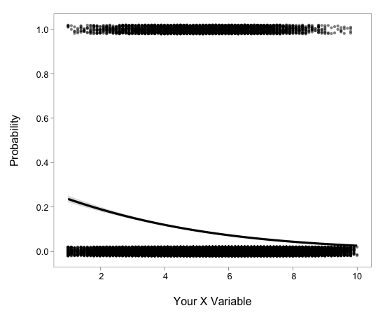
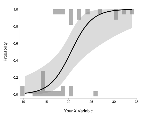
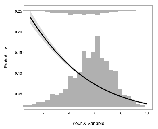
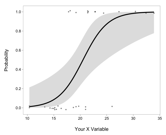
So my advisor pointed out this 'new' (well, 2004), way of plotting results of logistic regression results. The idea was presented in a 2004 Bulletin of the Ecological Society of America issue (here). I tried to come up with a solution using, what else, ggplot2. I don't have it quite all the way down - I am missing the second y-axis values for the histograms, but someone smarter than me can figure that part out (note that Hadley doesn't want to support second y-axes in ggplot2, but they can probably be hacked on).
Here's the code:
Here's a few examples using datasets provided with the ggplot2 package:
loghistplot(mtcars[,c("mpg","vs")])

loghistplot(movies[,c("rating","Action")])

And two examples of the logpointplot function:
logpointplot(mtcars[,c("mpg","vs")])

logpointplot(movies[,c("rating","Action")])
